Before & AFTER: Shanna's Craft Room/Closet {part II}

Oh happy day. My craft room/closet transformation is finally complete!  I'm going to give it all away right up front and post a before and after picture.  I'm so proud.  In fact, so proud that I'll show the after first!

AFTER - bright, cheery, sunny, organized ... ahhhh.


BEFORE - dark, scary, ugly, embarrassing, & waste of space


Squeeeeeeee!  OK, with my girlish excitement now out of the way, I can turn to the nitty gritty details on how the dark ugly closet went to a swoon-worthy, cute as a button room.  Last week, I blogged about the first step of the process - the day that I made the repairs, hung the plywood and peg board and moved in the furniture that I refinished.  I also used that first day to organize the contents of the closet.  I'll describe the organization of the closet in more detail below.

My second day of work was all lipstick and rouge:  primer, paint and accessories!  Love love and love.  Here's how it went down.  First, I primed the room.  I had the white latex primer on hand, so I used that first.  The room is mostly studs and unfinished plywood on the walls and ceiling, so I knew priming was a must.  I decided to prime everything: studs, unfinished drywall, plywood, trim, even the heating duct (which was an unfortunate shade of messy black thanks to a well-intentioned contractor who removed the asbestos).  Here it is after a coat of primer (note: I was somehow able to restrain myself from painting the floor)


Doesn't it look worlds better already?  Once the primer dried, it was time to paint! My original plan had been to use the leftover nearly-full gallon of pale blue paint from the nursery (Icelandic by Sherwin Williams), but full disclosure: I could not handle painting *another * blue room in my house.  Don't get me wrong, I love blue.  I mean, hello, walk in my house and it is abundantly clear how much I love blue.  But I realized that in the past year, I have painted nearly everything blue: the bathroom, the laundry room walls and floor, even my kitchen and powder room are a bluish gray.  I needed to step away from the blue.  So I hit up Lowes' "oops" paint area and lo and behold, I found a full gallon of Valspar Pecan Cream: a bright, sunny yellow. I snatched up that gallon (for $5!) and my paint geek self rejoiced.  So, I used the pecan cream on the walls and ceiling and painted a fresh coat of white trim with my favorite trim color, Dover White by Sherwin Williams on the white bits of trim in the room.  The Pecan Cream is a little brighter than I would have liked, but it does a good job of brightening up the closet.  And for $5 I can't really complain.  Here's the freshly painted space.


And now for accessories and organization!  I divided the room into three distinct sections: (1) gift wrapping; (2) paper love and crafts; and (3) sewing.  Now everything has a place.

Gift Wrapping Section


I used a tall bookshelf here (that I painted white) to organize all my gift wrapping needs.  The top shelf holds cards in the card box I blogged about last week, as well as two other boxes that I covered with fabric I had on hand (a tutorial post will follow soon).  These boxes hold tissue paper and curling ribbon & bows.  The second shelf has a big narrow basket that I already owned, and in it is scraps of ribbon.  The bottom shelf stores my wedding shoes and cards on the left and a bin of the kids' artwork from school on the right.   I used the pegboard to be a ribbon station and to hang my most-used supplies.  This was super simple: I just bought some dowel rods from my local hardware store, and suspended the rods from some peg board hooks, threaded the ribbon through the dowel and voila.  I also hung my favorite scissors in a hanging Mason jar that I picked up during Jamie's and my trip to the Pottery Barn Outlet, as well as my trusty upholstery stapler and beloved Sherwin Williams fan deck.  I picked up the cool black and white tote to hold rolls of wrapping paper.  I hated the way the floor looked, so when Jamie and I were at the Pottery Barn Outlet, I couldn't resist this cute yellow rug (on sale for $9).  I used a frame I had on hand and framed a yellow Susy Jack calendar print on that wall and called it a day.  I used cute labels from Paper-Source that I had on hand to create labels for all of the contents of my baskets and bins, sticking the labels on some and hanging them from ribbon on the baskets.

Paper Love/Craft Section


For the crafty section of the room, I used another old bookshelf that I had (and painted it white).  This sucker used to have doors, which made it such a pain to access.  So I knocked them off and re-purposed it as open shelving instead.  I already had the clear bins and sorted the contents and made labels for easy identification of the contents.  I keep labels and paper in the little two-drawer unit on the floor, which I had used for storing ribbon before.  The little clear bins formerly had blue tops, and being the insane person that I am, I spray-painted them the green to go with the new color scheme.  The blue was making me nuts.  I know ... I added the labels to the bins for easy identification.  The plastic two-drawer unit on the floor holds paper and card stock.


Sewing Section


Finally, this is the sewing area.  I had the drawer unit and the little cubes already and pushed them together to form a nice, neat little storage system.  The drawers hold my fabrics and the cubes hold my mini-sewing machine, my sewing kit (that my mom gave me a few years ago!) and baskets for more accessories.

The room still functions as storage space, too.  I keep our extra table leaf in here and secured it to the studs with some bungee cords that I picked up at Dollar Tree.  I also keep our suitcases in the corner and hang my diaper bag along the entry wall (though, sadly, with Little almost potty trained, the diaper bag's days are numbered). Here's the table leaf -- nice and secure. You can also see how I painted all the studs and unfinished dry wall.


And as promised, the budget breakdown.  You will recall that I set a $30 budget to transform the space. Ok, I went over budget.  I ended up spending just shy of $50.00:

* $5 paint (Lowe's Oops Paint, Valspar in Pecan Cream, high gloss)

* $20 peg board and plywood (from Lowe's and Home Depot)

* $1.50 peg board hooks

* $10 pvc moulding (I went with PVC because it's soooo easy to cut!)

* $1.00 - tote for wrapping paper (I used a credit at Marshalls to get this)

* $1.00 - dowel rod

* $1.00 - bungee cords for securing table leaf

* $9.00 - rug from Pottery Barn Outlet

* $0 - furniture, baskets, plastic bins, labels, trim paint, primer, hooks, artwork and frame

All in all, worth every over-budget penny, I think!  My goal was to make use of this formerly wasted space and to pretty it up, both so that I could enjoy it now and so that in the future when we sell the house, someone might adore the bright, cheery bonus space.  What do you think?

So what's next? That's the inevitable question when I cross something off of my to-do list.  I have a bunch of smaller projects lined up for my place and a few really large ones. However, the large ones all involve lots of painting and/or outdoor spaces (i.e., refinishing the cabinet I bought from the ReStore for the kitchen, painting the garage walls and floors, organizing the garage, organizing our storage shed in the yard), so those will have to wait until Spring. Fear not, my sweet mother-in-law has graciously allowed me to do some big time work on her home, starting with the dining room. I get to tear down wallpaper, paint, hang moulding ... oh, happy happy joy joy! Stay tuned for those posts!

See you swoon,

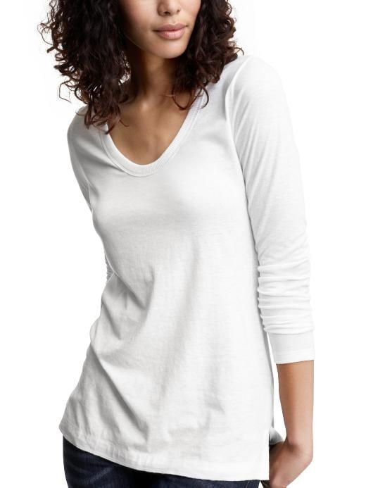
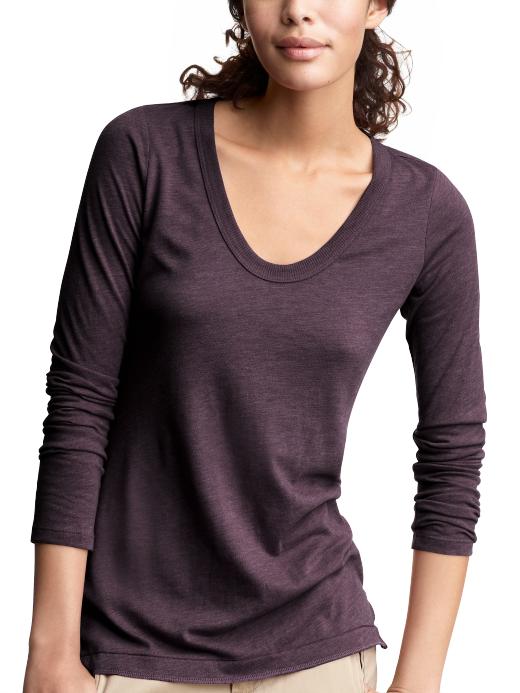
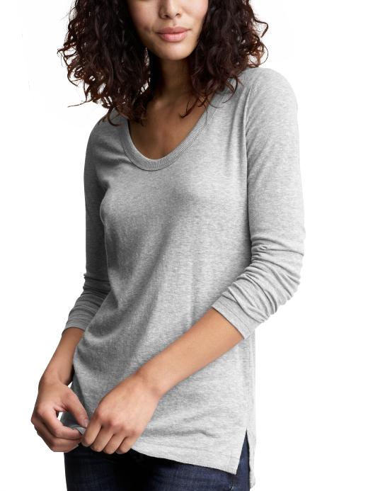
What Would Jamie Wear: Vintage Long Sleeved T

The shirt I bring to you today is one of my all time favorites from Gap. I know it is a simple basic (one of my favorite things ever) but this soft long sleeved t is perfect for lounging or running around on the weekends. I have extra long arms which is a nightmare trying to find tops but Gap is one of the companies I love since they started offering sizes in tall.

I have officially bought about 8 of these tops. This way if something happens to one I will have a back up, and for $7.99 a piece, they were worth every penny.

These shirts will not dissapoint, trust me. Shanna saw the one I was wearing and went out and bought two for herself!

What are some of your favorite basics? Do you have a go to store to find comfy pieces like this one?


See you swoon,


Before & Middle: Shanna's Craft Room/Closet {part I}

A month or so ago, I posted my plans to redo the large storage closet in our one bedroom and make it into a functional, cute craft room space.  Up today is the first of a two-part reveal of how that space turned out.  There would be an obscene amount of pictures if I tried to do the big reveal in just one post, so today will show the before and "middle" stages.  The before and afters will go up on Monday -- just to add as much suspense as possible.

It took two full days to transform the space from a scary blank slate to a sweet, pretty little room.  Here's where I started:  this is what you used to see when you opened the door.  Tubs and piles of stuff that were just waiting to be organized.  The closet has always been this minty green color.  When we moved in, I added a bunch of hooks, which until recently held lots of purses that I never used.  I donated the purses, so I could ditch all but three of the hooks.

before


Once I cleared out the space, I did some repairs and cleaning and then put some of the storage furniture I already had back in the space.  Here is how that same spot looks after a day of work.


Up next is the far wall of the closet.  It was total dead space with the studs exposed and a sagging plywood wall and ceiling.   Gross.  You can also see the big gap between the sheet rock ceiling in the foreground and the plywood behind it. Ug-ly.


I took care of business and totally repaired everything in that area.  I hung pegboard and plywood on the back wall to hide those ugly studs, and added some trim while I was at it.   For that ugly gap between the sheet rock and plywood there in the front, I added some trim and used caulk to seal the gap.  Doesn't it look better already?  Even before I've taken my trusty paint brush to it?


Next up is the long wall of the space.  You can really see the sagging wood on the ceiling and that awful gap in the ceiling, too.  Here's the shabby before, with piles o' stuff and once I removed it.


And here's that same spot after I took my tools to it.  I added the trim and caulk and decided to go for broke by adding some moulding along the ceiling and "wall" in the middle.


Oh, and by the way, because I am insane and love to paint more than words can express, I updated the old fake wood [read: cheap] bookcases by taking advantage of a super warm January day here in PA (i.e., 50 degrees) and painting them white.  They went from totally geek:


to like totally chic.


There you go!  A recap of one day's hard work.  In one day (9:30-4:00) I emptied the space, removed all hooks and miscellaneous nails in the wood, cleaned the space, repaired the wood ceiling and walls, hung peg board, hung plywood on the wall and ceiling, added trim and moulding, cleaned the heck out of the space, organized all of the contents that were going back in the space and moved everything back in.  Day 2 was all about painting and accessorizing.  Stay tuned for the big reveal ...


See you swoon,


What Would Jamie Wear: Celebrity Styles

Lately I have been creating mood boards (or draft emails that I plan to turn into mood boards) of celebrity styles I love.  I may not always love the entire outfit but I save them because I like something about how the clothes are layered together or combined with other pieces and accessories.

Here are some outfits I have found recently.  A great source for this is people.com, all you have to do is go the style section, go figure, this is my favorite part of their magazine as well!  Most of these pictures will come from the Stars looks for less, let's face it, most of us reading this are not celebrities so we cannot afford the clothes they wear but to find similar pieces for less?  SCORE!

Check these out, which picture is most like your style?  What items would you like to add to your wardrobe?

I love these flat black boots, I have yet to find a pair of flats that do not make me feet look like boats but these look great on her.  I am also a sucker for stripes so I need to find a cardigan just like this one.


JESSICA ALBA photo | Jessica Alba


UMMMMM.  LOVE.  There are no other words, I need this entire outfit.


KOURTNEY KARDASHIAN'S JACKET photo | Kourtney Kardashian


Not a huge fan of the jeans but the layering up top is beautiful and looks so cozy. JESSICA ALBA'S PURSE photo | Jessica Alba


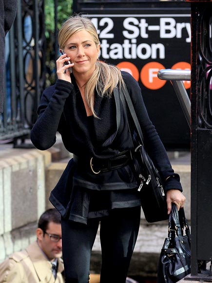
Jennifer Aniston is actually wearing a wrap sweatshirt here with leather trim.  This is a great way to wear a comfy top but still remain true to your style.  If I can get my hands on this sweatshirt you can be sure it will be mine.


JENNIFER ANISTON'S SWEATER photo | Jennifer Aniston


It is hard to see myself in this at the moment since we are in the process of getting 12 inches of snow but this is such a simple summer outfit to run around in.  I love how the belt adds some interest and she pairs it all with a cute bag.


Daftbird Racerback Tank Dress in Heather Grey


Happy Shopping!


See you swoon,

January Challenge {week 4}: Getting Carded

Here is the final installment of my January organizational challenge! So far, I have successfully (and inexpensively) organized the cords under my TV in week 1, my desk in week 2, and my daughter's hair bands and bows in week 3.  Up today: my greeting card stash.  My mom is good friends with a woman who makes hand-crafted greeting cards.  They are so unique and lovely, and I can count on Mom giving me a bunch of cards at Christmas and on Mother's Day.  I love it! I haven't had to purchase a card in years. The only issue has been storing them.  But a pretty green box from Garnet Hill and a few minutes with some scissors completely solved that problem.  Here are the deets:

Before, my mom had given me a greeting card organizer, which worked great.  The only problem: it was too small to hold all of my cards!  I ended up having to keep a bag next to the organizer to handle the extra cards.  You know me, and you know how this would bug me.  Here is the before storage solution - note the huge stack of new cards next to the already stuffed to the gills box.


When I opened my Christmas gifts, I was happy to discover that he bought me the cutest slippers from Garnet Hill ... not only because I desperately needed new slippers, but also because the gift box in which they were packaged was so darn cute and pretty!  I just love the soft, cheery shades of green.


It just so happens that the slipper box will neatly fit my greeting card collection!  Score!  I had to cut the dividers to fit in the new box, which only took a few minutes.  I love the dividers that came with the old card box, because they organize the cards by occasion.


Once I cut the dividers down to size and put the cards in their appropriate section, it was finished!  I decided to go for broke and add a cute little label to the outside of the box that says "Cards" on it in a fancy font (it's Chopin for you font-geeks).


Ta da!  What do you think?  The best part of this project is it was completely free! I had all the supplies (box, dividers and label) on hand already.  I think my DIY card box looks absolutely perfect in my new craft room/closet.

I've really enjoyed these quick and easy (or is it quick and dirty?) organizational posts in January. In fact, I think I'll continue them into February. My closets need some tending to ... so my February Challenges will be all about tidying up three closets in my home: the master bedroom closet, the downstairs coat closet and {gulp} the big mondo basement storage closet. Stay tuned, fellow organizational lovers!

See you swoon,


What Would Jamie Wear: What is Molly Wearing?

I love What Would Jamie Wear days but today I thought I would mix it up a little bit.  One of my best girlfriends, Molly, is one of the most stylish people I know.  I have been saying  to Shanna lately that I wanted to add another element to these posts to show you styles other than my own.  Not only is Molly a friend of mine, I have the pleasure of working with her as well so we spend a lot of time together!

I love seeing her walk in every day and analyzing each article of clothing she has on, the best part, she is a MAJOR bargain shopper and still manages to look like she is wearing expensive designer clothing.  Of course sometimes she does have a designer label on but we all need a few pieces in our wardrobe that may break the bank a little, especially a versatile piece that you can wear with all the other things you buy for a great deal!

So without further ado, I am pleased to introduce you to Molly (Hi Schmeee!, this is my nickname for her in case you were wondering what that shriek was).


You will be seeing more of her as I find pieces or entire outfits that she has worn into the office that I have fallen in love with (and secretly try and figure out how to get them into my wardrobe).  Today I am showing you a pair of Steven by Steve Madden boots that she bought last week.  These were not necessarily a bargainbut they were on sale and the color, amazing.  A sale in my mind is a bargain but for those of you hoping for the miracle $40.00 boot that is perfect in every way, I have not found them yet (will keep you posted if I do).  These boots have a versatile color, a great wedge heel for added support and have beautiful details with the zipper down the back and fold over, not to mention the perfect toe shape.  I am going to stop talking, take a look at these lovelies:


Breathtaking, I know.  I just bought boots and this makes me want another pair!  I hope you all enjoy!!  Have you made any purchases lately or are you planning on making any?  What are you pining over?


See you swoon,

Swoon-Worthy: Colleen & Craig's Wedding {part 2: the details}

On Wednesday, I blogged about Colleen and Craig's fabulous wedding at the Morris House Hotel back in September 2009.  Jamie and I coordinated the big day and also created a bunch of details for the event.  I was so proud of the work that we did - it was all very custom, very pretty and very, very affordable.

Colleen's color palette was sage green and soft cream with pops of navy blue and copper.  We had a ball putting together all the little touches that made her wedding day so infused with her personality and that made the guests feel that everything was incredibly special and personalized.  Here are some of the things we did:
* Petal Cones*

Colleen wanted her guests to toss flower petals as she and Craig recessed up the aisle.  So, we created these little DIY petal cones to hold dried ivory rose petals, baby blue hydrangea blossoms and light green shamrocks (the bride and groom are both Irish, so the shamrocks fit).  We ordered pretty patterned paper from Paper-Source, made a cone shaped holder, added a custom label with instructions to the guests and used an ivory satin ribbon to hang from each chair.  Cute, no?


* Free Form Crystal Chandelier *

Colleen really loved the look of crystal chandeliers hanging from wedding tents, but Jamie and I knew our limits, and hanging real live wired chandeliers was definitely beyond them.  So we created our own by using long strands of faux crystals and making them in a chandelier-swag type shape.  We had to use an 8 foot tall ladder to create this.  Well, Jamie used the ladder, while I held it steady.  The chandelier looked nice during the day but really stood out beautifully at night.


* Placecards*

We saved a bundle on placecards by doing them ourselves.  Rather than pay a calligrapher to do it, we used a pretty font (appropriately named, "Beautiful") for each guest's name.  We printed on ivory card stock and mounted on navy placecards from Paper-Source.  Colleen bought sweet silver cups and had the florist fill each cup with an ivory rosebud, while we propped the placecard on the top.  The end result was so elegant.


*  Photo Booth Sign*

Colleen and Craig hired Shutter Booth Philadelphia for their reception.  The photo strips from the booth served as their guest book and favors for the guests.  It is really fun (and funny) to see the progression of the photos as the night went on.  Ha.  Colleen wanted us to create a sign for the photo booth to let people know that one strip was their favor.  We jumped on it and made this little number and had Kinkos print it on foam board.


* Reception Tables*

Colleen had a vision of dining under the stars with lots of sparkle and candlelight, and we were happy to help make that happen.  We created custom menu cards for each person, wrapped a thick navy velvet ribbon around each menu and gently placed a leaf under the ribbon.  The full effect was just gorgeous.  We also created custom table numbers for each table, which were so simple by printing on ivory card stock and mounting on navy card stock.  Colleen chose sage pin-tucked silk tablecloths and stunning ivory florals to tie everything together.


* Bar Area*

The bar area (where cocktails and the after-party were held) was a challenge.  It was dark and kind of dull, and Colleen wanted it to feel as pretty as the tent area.  So we helped with that.  We hung clusters of white paper lanterns all over the room and suspended them from the ceiling with sage satin ribbon.  For the bar itself, we created custom drink stirrers for their signature cocktail (the mojito).  These sweet stirrers said "i do!" and "oh happy day!" on them and were made with card stock and some bamboo skewers.  We also created a bar menu entitled "Libations and Such" which listed out all the drink offerings at the bar.  Finally, Colleen saw lollipop trees in a wedding featured in Martha Stewart Weddings and wanted them at her reception.  These look tricky but are so easy to recreate.  We made custom signs for these that said, "Candy is dandy but liquor is quicker" and put them on the bar.  They were a huge hit.  An even huger hit was the Irish Car Bomb station that Colleen surprised her groom with.  Even that got a shot of pretty with the custom sign we created that said "Bombs Away! Irish Car Bombs".  Gotta love a wedding where even Irish Car Bombs get a little swoon-worthy attention.


And that about wraps it up!  Colleen's guest list of about 100 people made projects of the scale much more manageable, and we had a lot of fun putting it all together.  If you'd like some help making a party more swoon-worthy, give us a shout! We'd love to help.  And because I cannot close a wedding-related post without one last shot of the happy couple, here you go!


See you swoon,


{all photos courtesy of Eric Mencher Photography}